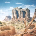
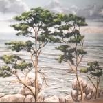
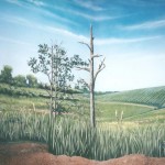
I was into camo long before it became fashionable. I’ve been a collector of all sorts of camo from all sorts of countries. Understanding the principles of camouflage (counter shading, breaking up the outline and mimicking the background), learned in the Marines, has been of surprising utility in my mural career. Often I’m presented with a wall that is less than ideal for creating an illusion. The perfect wall for a muralist is utterly simple: flat, white, curved corners, no obstructions, no angles, no electrical features. Most zoo buildings are existing structures that must be retrofitted to create a believable natural environment. Consequently, the muralist winds up with unwanted architectural features such as soffits, columns, pipes, walk doors, jogs in the wall, windows and skylights. My job is to make them go away.
My attitude toward naturalistic environments is that either we’re in Africa, the Outback, the Arctic, the Amazon, or we’re not. No half-measures. These locales do not have fire emergency lights, bright red Exit signs, thermostats, security cameras, electrical outlets, light sconces, fuse boxes, or hinges and door knobs. Sometimes such features can be hidden or obscured, and sometimes the Fire Marshal’s intransigence spoils the whole illusion.
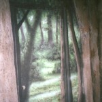
Vertical lines such as the juncture of two walls or the sides of a door can be disguised as tree trunks or straight, hanging vines, but horizontal lines are much harder to explain visually.
Can you find the hidden doors?
The worst-case scenario is to have windows in a mural. Unless you cover the window, there’s no way to make a brightly lit rectangle look appropriate in the middle of a sky or forest. A related disaster is skylights, which are invariably rectangular and so cast bright, rectangular pools of light that move across the exhibit and my mural image with the passage of the sun. Indoor lights are preferable to skylights any day unless the skylights can be north-facing and devoid of any edges or mullions.
Sometimes the best solutions are not painted solutions. A set of pipes in a corner or ductwork overhead in a hallway can be disguised three-dimensionally with surplus military camo net with artificial leaves woven into the net. Other times a set of pipes can be covered with a cardboard sauna tube and disguised as a tree trunk. Hollow rocks work well for drain covers, and arranging the rock work to obscure the view of feeders or transfer doors and keeper doors should be considered before anything gets built. I’ve seen an unfortunately large amount of finished rock work that could have been used differently with just a little forethought about hiding unwanted features.
The best way to avoid these dilemmas is not to create them in the first place and to consult a muralist ahead of time. Most architects and many designers don’t have a clue as to what the muralist needs and might be disappointed to learn that a plain, white wall with curved edges is all we need. Let the muralist take care of making the illusion successful.
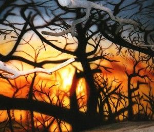 And now, a few “war” stories. There have been a few cases where I was able to do the impossible. One example was at the Staten Island Zoo. They asked for an African sunset in the leopard exhibit, but there was a concrete baobab tree across the hall casting a lot of branch shadows on the mural wall. The solution to these shadows was to paint them black and paint other branches and thorny brush around them as well, creating the silhouette of a thicket through which the sunset was seen. Then in one unshadowed spot, the center of the sunset, we used a focused beam of light, its origin hidden among the tree branches. It made the sunset appear to glow.
I was pleased to notice visitors come around the corner in the hall where they first saw the mural and squint as if the sunset might hurt their eyes. An unscientific survey of visitors exiting the building seemed to indicate that most people thought the sunset was electrically lit from behind. The effect may have been too successful, in fact. After saying they saw no hidden spotlight, they asked, “What leopard?”
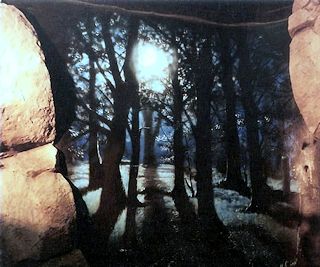 A similar effect was achieved in a nocturnal exhibit at the Lake Superior Zoo in Duluth, where there appeared to be no good places to illuminate the little furry critters (I think they were some sort of gerbil-y thing) that cruised around the bottom of the exhibit. But when I painted the night scene and put a bright, full moon at its top, I found that hitting it with a focused beam from across the room bounced sufficient “moonlight” into the exhibit for watching the little nocturnal fuzzies cavort.
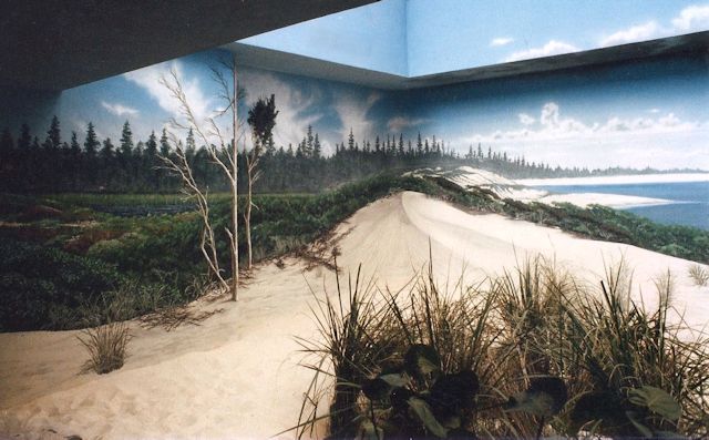 Sometimes you can’t make a feature go away, but you can reduce its impact. In a shore bird exhibit at the Milwaukee County Zoo Aviary, which featured open sky above the ocean, there was a horizontal soffit running the length of the wall. By creating a stormy horizontal cloudscape I was able to incorporate the shadow of the soffit into the illusion. Most visitors reported not noticing it.
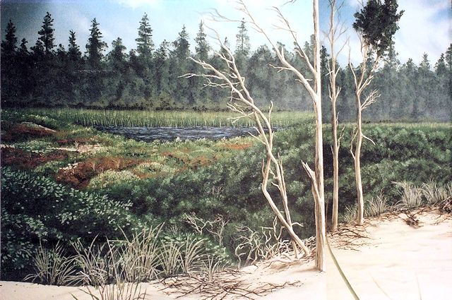 In the same exhibit in Milwaukee’s Aviary, there was a curved, 90-degree corner at one end of the wall accompanied by a jog in the side wall. Painting the illusion of a sand dune coming toward the viewer in the curved corner, which was actually going away from the viewer, eliminated the curve. The jog was handled by painting vertical, thin trees. Most visitors didn’t notice that, when their perspective moved, the edges of two of these trees would move sideways in relation to one another because of the jog.
Often I find frosted panels with white enamel borders around lights embedded in a ceiling that is intended to look like a sky. The best I can do is make sure blue sky exists between the lights and that a white cloud coincidentally occurs where the lights occur, making them less obtrusive.
The problem of perspective in a mural is also poorly understood by designers and architects. Having an object butt into a mural wall and expecting the muralist to paint the illusion of it continuing in space is a formula for disaster. The reason is that the perspective depends upon the visitor seeing it from one point only and not moving their head. The worst example I’ve faced was a primate exhibit in which the designer placed a fallen concrete tree trunk extending from one side wall across the exhibit to the other side wall. If I could have set up a panel with a pinhole through which the visitor would look, I could have made the log extend indefinitely in either direction. But as soon as the visitor’s head moved from one side to the other, the log would appear to bend at weird angles. So the final solution was to have one end of the log by brush so that I didn’t have to continue the straight line and have the other end erupt into a root ball where the log met the wall.
The same problem in the same building occurred when I was asked to create the illusion of being high up in the rainforest canopy and able to look down 100 feet to the forest floor. With the floor of the exhibit being at about shin level, the perspective issues were insurmountable, and we left the concrete bare. Total failure.
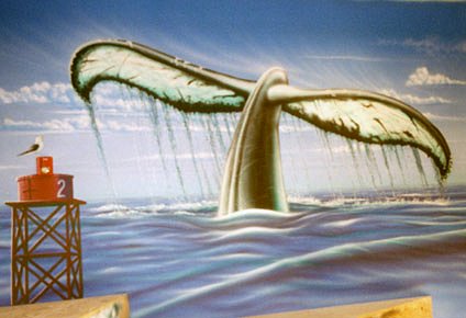 Another example of incorporating three-dimensional elements was the use a red fire emergency light in the middle of a sky above an ocean by incorporating it into the illusion of a red channel buoy (see also the Mostly True Tale, A Whale of a Tail).
A final, if desperate, solution is to limit the vertical or horizontal sight line of visitors, maybe with artificial foliage or rock, maybe just with architectural elements so that they can’t see the offending feature.
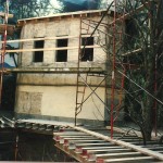
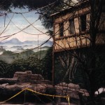
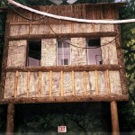
One final success story. The Louisville Zoo’s new aviary had a large central flight room, with a domed skylight, that was supposed to become a rainforest. But in two of the corners the architect had placed large, protruding two-story concrete bunkers with small windows at the second floor level so that visitors in the upstairs gallery could look down into the free-flight room. The bunkers seemed impossible to hide.
Then someone had the idea that we disguise them as structures appropriate to the rainforest theme: native huts. Now, most native huts are not two stories tall or made of concrete. So I proposed that we put thatched roofs on them, paint the top half as a one-floor hut made of bamboo, woven panels and other lightweight material, and disguise the corners of the lower half as log supports. On the surfaces between the logs I painted the same jungle that appeared on either side of the bunkers and, whoa! The huts seemed to hover on stilts above the forest floor.
